Category Archives: data saving lives

To Make Hospitals Less Deadly, a Dose of Data

The true horror of modern hospital medicine is starting to be revealed.

440,000 deaths per year (up from 96,000 based on 1984 data) – one sixth of all deaths nationally, making preventable hospital error the third leading cause of death in the United States.

http://opinionator.blogs.nytimes.com/2013/12/04/to-make-hospitals-less-deadly-a-dose-of-data/?hp&rref=opinion&_r=1

To Make Hospitals Less Deadly, a Dose of Data

DECEMBER 4, 2013, 11:00 AM
By TINA ROSENBERG

Going to the hospital is supposed to be good for you. But in an alarming number of cases, it isn’t. And often it’s fatal. In fact it is the most dangerous thing most people will do.

Until very recently, health care experts believed that preventable hospital error caused some 98,000 deaths a year in the United States — a figure based on 1984 data. But a new report from the Journal of Patient Safety using updated data holds such error responsible for many more deaths — probably around some 440,000 per year. That’s one-sixth of all deaths nationally, making preventable hospital error the third leading cause of death in the United States. And 10 to 20 times that many people suffer nonlethal but serious harm as a result of hospital mistakes.

Most of us decide which hospital to go to (that is, when we get to decide) with zero data about hospital safety. Information, however, is gradually reaching the public, and it can do more than just help us choose wisely. When patients can judge hospitals on their safety records, hospitals will become safer. Just as publishing health care prices will drive them down, publishing safety information will drive hospital safety up.

In theory, finding this information shouldn’t be a problem. Hospitals began to track errors seriously around 2000. The federal government’s Centers for Medicare and Medicaid Services began collecting information on hospital quality in 2003, and since 2005 has been posting information on the website Hospital Compare. Many states have their own websites.

Other organizations compile this information as well, such as Consumers Union’s Consumer Reports (subscription required), which scores hospitals on their safety and the quality of care. The Leapfrog Group, which represents employer purchasers of health care, scores hospitals on safety measures. (The hospital ranking site probably most familiar to readers, U.S. News’ Best Hospitals rankings, describes its mission as a very different one — to help patients with very difficult problems choose hospitals.)

All of these groups measure different things, which is why a hospital can rank near the top on one list and near the bottom on another. Most groups make money by charging hospitals to use their logo and ratings in their publicity. Consumer Reports is an exception — it doesn’t allow hospitals to advertise its rankings.

“There is no longer a question of whether or not people have a right to information about quality, and that hospitals should be transparent and accountable,” said Debra L. Ness, the president of the National Partnership for Women and Families. Ness is on the board of the National Quality Forum, the organization that sets standards for evaluating health care safety and quality. “It’s not so much any longer a debate about whether — it’s more about how.”

But so far, the answer to the question of how is “slowly.” There is a big advance coming — Hospital Compare plans to begin reporting on rates of MRSA (or methicillin-resistant Staphylococcus aureus, a drug-resistant bacteria) and C-diff (Clostridium difficile) infections this month. These are dangerous, high-prevalence infections — crucial safety issues to track. But they are an exception on Hospital Compare. Much of what the public wants to know isn’t there — and a lot of what’s there isn’t meaningful.

What’s your hospital’s rate of surgical site infection? You can find out if you live in California or Pennsylvania — states that collect exhaustive information on hospital infections and post it. The rest of us are out of luck. Hospital Compare will tell you only about colon surgery or abdominal hysterectomy — no knee replacement, heart bypass or any other surgery. How often does your local hospital leave a foreign object (like a surgical sponge) inside a patient? Or administer the wrong type of blood? Or allow a patient to develop a serious bed sore or a blood clot? Hospital Compare is now listing only old data for these errors, and has stopped updating those measures on the site.

What about the hospital’s record at preventing re-admission in the 30 days after discharge? We can find that out for Medicare patients (the data comes from Medicare claims), but not for the rest of us. “Hospital Compare has a lot of bells and whistles but underneath it is nothing,” said Leah Binder, the chief executive of The Leapfrog Group. “Most hospitals are rated as average on every measure, and most measures are not things of great interest. We’re further along, but we’re really in the dark ages on reporting information in a way the public can use.”

Measuring hospital safety is hard. Comparison, of course, requires everyone to be using the same measures — so how to reconcile the many variations hospitals use? And how do we know a measurement actually tells us what we think it does?

It’s easiest to measure how often hospitals carry out processes that are recognized to be best practice, such as whether the patient got treatment to prevent blood clots after certain types of surgery, or whether the patient’s temperature was kept steady in the operating room. Hospitals track such processes for their own internal quality controls.

This kind of process information dominates Hospital Compare and some of the independent rating organizations. (U.S. News’ rankings lean heavily on a hospital’s reputation, which earns it heavy criticism.)

But tracking processes doesn’t produce the kind of information patients need. Hospitals are doing so well on these measures they are topping out, offering no way to compare them. Some of the measures are only loosely related to patient outcomes. For example, Hospital Compare shows that the national average for the practice of discontinuing prophylactic antibiotics within 24 hours after surgery is 97 percent. Top marks — but there is little evidence showing that this practice is linked to fewer surgical site infections. And it’s outcomes that count.

Why doesn’t Hospital Compare list more outcomes? Hospitals argue — and they are right — that it is much more expensive and technically difficult to develop outcome measures than process measures. “We need measures that have scientific reliability and validity,” said Nancy Foster, the American Hospital Association’s vice president of quality and patient safety policy. “Hospitals need the engagement of medical staff. If medical staff doesn’t find the data credible then you lose them — they won’t be there in the quality improvement. “

But at times it seems as if hospitals aren’t trying very hard. They like to report process measures on which they score well. But with 440,000 deaths from hospital error per year, their record is poor on key safety outcomes. This somewhat dampens their enthusiasm for public reporting. And what hospitals want matters a lot. “At the end of the day, the providers have to implement this,” said Ness. “There has to be a reasonable amount of buy-in for it to work well.”

“If you just looked at Hospital Compare’s process measures, you’d assume that all hospitals in this country are doing extremely well,” said Binder. “This is misleading to the public because of the politics behind the scene of the website. Lobbyists for providers have been very effective at making sure what gets reported doesn’t have much teeth.”

Hospital Compare chooses what to display mainly using guidelines set by the National Quality Forum, which was established in 1999 in response to a government commission on consumer protection in health care. At the Quality Forum, groups representing health care consumers — patients and the corporations who pay for health care — are represented on all committees, and they hold a guaranteed majority on the most important committee. But patients can’t match the clout of the providers. “Hospitals are ever-present in this work,” said Lisa McGiffert, who is director of the Safe Patient Project at the Consumers Union and has been a consumer representative on several Quality Forum committees. “They have lobbyists all over Congress and administration folks. They outnumbered us on the committees that I have been on at N.Q.F. When I was on the infections committee I was rolled over constantly.”

In a December 2011 meeting, the Measurement Application Partnership, a committee run by the Quality Forum, voted — over the objection of consumer and purchaser representatives — not to endorse reporting on several different serious hospital errors that were already on Hospital Compare. Hospital Compare then stopped updating data on air embolism, sponges or instruments left in a patient, serious bed sores and blood clots, among other events.

No one thought the raw data was unfair to hospitals — the data probably undercounted the number of hospital errors, said Foster. But hospitals argued that in some cases, the per-hospital numbers were so small the differences between hospitals might have been random, a conclusion supported by an independent review. (Hospitals have fought changes that would make reporting more complete — so it takes chutzpah to argue that the numbers are too small to publish.) “We agree with the concept,” Foster said. “But the way the measures are executed makes them very unreliable and, we believe, invalid. You don’t know that what you are looking at is an accurate representation of a hospital’s performance.”

Advocates for health care consumers argued that it didn’t matter — just knowing the number of errors was important. “Do you as an American have the right to know if the hospital down the street left an object in a patient?” said Binder. “That information has now been taken out of the hands of the consumer by lobbyists. We should always tilt towards transparency.”

Poor or irrelevant data keeps patients from finding the information they need. Another problem is that the data that’s there isn’t presented in a way people can easily use.

Hospital Compare cuts very thick slices. There’s below average, above average and average, which is the score of the vast majority of hospitals. And most patients simply don’t know about Hospital Compare. That’s not the government’s fault, but it does illustrate the need for translator organizations such as Consumer Reports — which has five categories, not three — and Leapfrog, which issues letter grades, with more detail available for those who want it.

Leapfrog’s twice-yearly data release gets a lot of coverage. McGiffert said that when Consumer Reports first came out with ratings for central-line and surgical site infections, some hospitals protested that the data was wrong. But it was the same data hospitals had submitted for state reports. “We were using data that had already been on state websites, but nobody had paid attention to it,” she said. “Agencies are never going to do a media push when they publish these.”

That media push reaches more patients, and it forces hospitals to focus on safety. “These are a major factor in getting hospitals’ attention,” said McGiffert. She said that hospitals in states that required public reporting were far more likely to adopt quality-improvement practices.

Binder said that except for advances in doctors’ using computers to enter treatment orders, hospital safety records, as a group, are not improving. This is hardly surprising. What gets measured gets done, and many aspects of safety are still not even measured. The Journal of Patient Safety study found 210,000 “detectable” deaths per year — the number they eventually fixed on of 440,000 reflected the estimate that half or two-thirds of all such deaths are never counted. “That’s a big range,” said Binder. “It sounds so high, but what more frightening is that we still don’t know. Nobody’s counting the bodies.”

Join Fixes on Facebook and follow updates on twitter.com/nytimesfixes. To receive e-mail alerts for Fixes columns, sign up here.

Tina Rosenberg won a Pulitzer Prize for her book “The Haunted Land: Facing Europe’s Ghosts After Communism.” She is a former editorial writer for The Times and the author, most recently, of “Join the Club: How Peer Pressure Can Transform the World” and the World War II spy story e-book “D for Deception.”

Hammerbacher, Sinai and Minerva…

Top piece on Sinai’s vision. Everything’s lined up there except the doctors – hmmm…. They’ll need some amazing insights to bust through the inertia, but expect they’ll glean them…

http://www.fastcoexist.com/3022050/futurist-forum/in-the-hospital-of-the-future-big-data-is-one-of-your-doctors

In The Hospital Of The Future, Big Data Is One Of Your Doctors

December 5, 2013 | 7:30 AM

From our genomes to Jawbones, the amount of data about health is exploding. Bringing on top Silicon Valley talent, one NYC hospital is preparing for a future where it can analyze and predict its patients’ health needs–and maybe change our understanding of disease.

The office of Jeff Hammerbacher at Mount Sinai’s Icahn School of Medicine sits in the middle of one of the most stark economic divides in the nation. To Hammerbacher’s south are New York City’s posh Upper East Side townhouses. To the north, the barrios of East Harlem.

What’s below is most interesting: Minerva, a humming supercomputer installed last year that’s named after the Roman goddess of wisdom and medicine.

It’s rare to find a supercomputer in a hospital, even a major research center and medical school like Mount Sinai. But it’s also rare to find people like Hammerbacher, a sort of human supercomputer who is best known for launching Facebook’s data science teamand, later, co-founding Cloudera, a top Silicon Valley “big data” software company where he is chief scientist today. After moving to New York this year to dive into a new role as a researcher at Sinai’s medical school, he is setting up a second powerful computing cluster based on Cloudera’s software (it’s called Demeter) and building tools to better store, process, mine, and build data models. “They generate a pretty good amount of data,” he says of the hospital’s existing electronic medical record system and its data warehouse that stored 300 million new “events” last year. “But I would say they are only scratching the surface.”

Could there actually be three types of Type 2 diabetes? A look at the health data of 30,000 volunteers hints that we know less than we realize. Credit: Li Li, Mount Sinai Icahn School of Medicine, and Ayasdi

Combined, the circumstances make for one of the most interesting experiments happening in hospitals right now–one that gives a peek into the future of health care in a world where the amount of data about our own health, from our genomes to ourJawbone tracking devices, is exploding.

“What we’re trying to build is a learning health care system,” says Joel Dudley, director of biomedical informatics for the medical school. “We first need to collect the data on a large population of people and connect that to outcomes.”

To imagine what the hospital of the future could look like at Mount Sinai, picture how companies like Netflix and Amazon and even Facebook work today. These companies gather data about their users, and then run that data through predictive models and recommendation systems they’ve developed–usually taking into account a person’s past history, maybe his or her history in other places on the web, and the history of “similar” users–to make a best guess about the future–to suggest what a person wants to buy or see, or what advertisement might entice them.

Through real-time data mining on a large scale–on massive computers like Minerva–hospitals could eventually operate in similar ways, both to improve health outcomes for individual patients who enter Mount Sinai’s doors as well as to make new discoveries about how to diagnose, treat, and prevent diseases at a broader, public health scale. “It’s almost like the Hadron Collider approach,” Dudley says. “Let’s throw in everything we think we know about biology and let’s just look at the raw measurements of how these things are moving within a large population. Eventually the data will tell us how biology is wired up.”

Dudley glances at his screen to show the very early inklings of this vision of what “big data” brought to the world of health care and medical research could mean.

On it (see the figure above) is a visualization of the health data of 30,000 Sinai patients who have volunteered to share their information with researchers. He points out, in color, three separate clusters of the people who have Type 2 diabetes. What we’re looking at could be an entirely new notion of a highly scrutinized disease. “Why this is interesting is we could really be looking at Type 2, Type 3, and Type 4 diabetes,” says Dudley. “Right now, we have very coarse definitions of disease which are not very data-driven.” (Patients on the map are grouped by how closely related their health data is, based on clinical readings like blood sugar and cholesterol.)

From this map and others like it, Dudley might be able to pinpoint genes that are unique to diabetes patients in the different clusters, giving new ways to understand how our genes and environments are linked to disease, symptoms, and treatments. In another configuration of the map, Dudley shows how racial and ethnic genetic differences may define different patterns of a disease like diabetes–and ultimately, require different treatments.

These are just a handful of small examples of what could be done with more data on patients in one location, combined with the power to process it. In the same way Facebook shows the social network, this data set is the clinical network. (The eventual goal is to enroll 100,000 patients in what’s called the BioMe platform to explore the possibilities in having access to massive amounts of data.) “There’s nothing like that right now–where we have a sort of predictive modeling engine that’s built into a health care system,” Dudley says. “Those methods exist. The technology exists, and why we’re not using that for health care right now is kind of crazy.”

While Sinai’s goal is to use these methods to bring about more personalized diagnoses and treatments for a wide variety of diseases, such as cancer or diabetes, and improve patient care in the hospital, there are basic challenges that need to be overcome in order to making this vision achievable.

Almost every web company was born swimming in easily harvested and mined data about users, but in health care, the struggle has for a long time been more simple: get health records digitized and keep them private, but make them available to individual doctors, insurers, billing departments, and patients when they need them. There’s not even a hospital’s version of a search engine for all its data yet, says Hammerbacher, and in the state the slow-moving world of health care is in today, making predictions that would prevent disease could be just the icing on the cake. “Simply centralizing the data and making it easily available to a broad base of researchers and clinicians will be a powerful tool for developing new models that help us understand and treat disease,” he says.

Sinai is starting to put some of these ideas into clinical practice at the hospital. For example, in a hint of more personalized medicine that could come one day, the FDA is beginning to issue labels for some medicines that dictate different doses for patients who have a specific genetic variant (or perhaps explain that they should avoid the medicine altogether). The “Clipmerge” software that the hospital is beginning to now use makes it easier for doctors to quickly search and be notified of these kinds of potential interactions on an electronic medical record form.

On the prediction side, the hospital has already implemented a predictive model called PACT into its electronic medical record system. It is used to predict the likelihood that a discharged patient will come back to the hospital within 90 days (the new health care law creates financial incentives for hospitals to reduce their 90-day readmission rate). Based on the prediction, a high-risk patient at the medical center now might actually receive different care, such as being assigned post-care coordinator.

Eventually, there will be new kinds of data that can be put in mineable formats and linked to electronic patient records, from patient satisfaction surveys and doctors’ clinical notes to imaging data from MRI scans, Dudley says.

Right now, for example, the growing volumes of data generated from people’s fitness and health trackers is interesting on the surface, but it’s hard to glean anything meaningful for individuals. But when the data from thousands of people are mined for signals and links to health outcomes, Dudley says, it’s likely to prove valuable in understanding new ways to prevent disease or detect it at the earliest signs.

A major limitation to this vision is the hospital’s access to all of these new kinds of data. There are strict federal laws that govern patient privacy, which can make doctors loathe to experiment with ways to gather it or unleash it. And there are many hoops today to transferring patient data from one hospital or doctor to another, let alone from all the fitness trackers floating around. If patients start demanding more control over their own health data and voluntarily provide it to doctors, as Dudley believes patients will start to do, privacy could become a concern in ways people don’t expect or foresee today–just as it has on the Internet.

One thing is clear: As the health care system comes under pressure to cut costs and implement more preventative care, these ideas will become more relevant. Says Dudley: “A lot of people do research on computers, but I think what we’re hoping for is that we’re going to build a health care system where complex models … are firing on an almost day-to-day basis. As patients are getting information about them put in the electronic medical record system there will be this engine in the background.”


JESSICA LEBER

Clinical analytics delivering results…

Two excellent factoids in support of clinical analytics:
1. Kaiser Permanente: “Today you have a 26% lower chance of dying in one of our hospitals than you do in other hospitals,” said Dr. Mattison, adding that Kaiser is starting to lower its mortality rate much faster than the national average. “A lot of this is directly rated to how we use data and integrate data,” he said.
2. University of Pittsburgh Medical Center has slashed readmission rates by 37% since it began using analytics to predict which patients were more likely to be readmitted to the hospital within 30 days.
The source WSJ posts are paywalled, but UPMC are using the Microsoft solution I was working on. Interestingly, it only requires administrative data to deliver its impact.
In discussions with WentWest Medicare Local, they have access to GP data and hospital data, which would start to fillout the picture in an amazing way…

Wednesday, December 11, 2013

There Is A Real Sting In The Tail In These Great Reported Results From The Use Of Analytics In Healthcare.

Two very interesting reports appeared a week or two ago.
December 5, 2013, 7:12 PM ET

Data Helps Drive Lower Mortality Rate at Kaiser

REDWOOD CITY, CALIF. — Kaiser Permanente’s use of data analytics is helping it lower hospital mortality rates and look for ways to diagnose illnesses earlier. John Mattison, chief medical information officer at Kaiser spoke, Thursday, at VentureBeat’s Data Science Summit in Silicon Valley. Dr. Mattison predicts that by the year 2020, ten times more medical research will be generated by analyzing vast quantities of medical data than by conventional models of clinical research.
Over the past several years, Kaiser Permanente’s hospitals in southern California – the region with the most members — have enjoyed a lower mortality rate than the national average, according to data from the Centers for Medicare and Medicaid Services. “Today you have a 26% lower chance of dying in one of our hospitals than you do in other hospitals,” said Dr. Mattison, adding that Kaiser is starting to lower its mortality rate much faster than the national average. “A lot of this is directly rated to how we use data and integrate data,” he said.
Kaiser Permanente has some advantages in data collection over other medical providers because it provides physician, hospital and pharmacy services as well as health insurance to patients. All of those records are electronic. When a patient visits a Kaiser hospital, their entire health record, including doctor visits and medications, is immediately available. Kaiser can easily track patient outcomes after hospital procedures because patients see their doctors within the Kaiser system for follow-up visits. It’s a closed loop and all of that information resides in one place.
The informatics department at Kaiser, which is growing, looks at medical studies as well as information from its anonymized pool of information about patient outcomes to make implementable recommendations that it sends to physicians and hospitals through information alerts. One of the most high profile examples of this happened about a decade ago when Kaiser looked at its database of 1.4 million members and discovered that patients who took Vioxx were more likely to suffer a heart attack or sudden cardiac death than those who took a competing medication. Physicians were resistant to these alerts in the early years but the culture has changed and the informatics department continues to get requests for more of these alerts, said Dr. Mattison.
More here:
We also had this appear on the very same day.
December 5, 2013, 10:32 AM ET

Analytics Helps UPMC Slash Readmission Rates

University of Pittsburgh Medical Center has slashed readmission rates by 37% since it began using analytics to predict which patients were more likely to be readmitted to the hospital within 30 days.
That represents considerable savings for the hospital in terms of providing urgent care, let alone saving the hospital from potential penalties levied by the Centers for Medicare and Medicaid Services for failing to lower those rates.
The trouble for most hospitals is that they’re geared up for the “average patient,” whereas no one is actually an average patient. The role of analytics at UPMC is to determine most precisely which course of treatment will be most effective for each individual.
“Analytics helps you determine who you should focus on,” said Dr. Pamela Peele, chief analytics officer for the UPMC Insurance Services Division during a visit to CIO Journal offices.
According to Dr. Peele, the factors that hospitals should pay attention to are “jaw-dropping.” Far from the actual health of the patient, those factors have to do with how patients used care in the past – what services they’ve received over time and whether the use of the services has been “lumpy or smooth” over time.
Lots more here:
What we have here are very positive reports of the value of analytics in improving hospital and health system performance at the level of the most important measure – improved clinical outcomes.
The sting in the tail is that both the organisations involved are very strategic users of Health IT and have been evolving and improving their Health IT infrastructures over decades. They also have integrated environments where EHR data from both hospitals and ambulatory systems is easily accessible as well as the billing / insurance information and all that can be used for analysis.
For Australian Hospitals they have no access to the GP records and Medicare Payment records – so it now becomes very tricky to obtain such benefits.
It is really only those organisations that hold relevant ambulatory, hospital and insurance information which is easily accessible, and that also have a very advanced IT infrastructure that can replicate this. I wonder are the gurus and NEHTA and DoH working out how these sorts of benefits can be replicated in Australia or is the plan to mine the PCEHR to do a very second best effort?
Time will tell I guess.
David.


Healthways…

http://www.healthways.com  || http://www.healthways.com.au

Christian Sellars from MSD put on a terrific dinner in Crows Nest, inviting a group of interesting people to come meet with his team, with no agenda:

  • Dr Paul Nicolarakis, former advisor to the Health Minister
  • Dr Linda Swan, CEO Healthways
  • Ian Corless, Business Development & Program Manager, Wentwest
  • Dr Kevin Cheng, Project Lead Diabetes Care Project
  • Dr Stephen Barnett, GP & University of Wollongong
  •  Warren Brooks, Customer Centricity Lead
  • Brendan Price, Pricing Manager
  • Wayne Sparks, I.T. Director
  • Greg Lyubomirsky, Director, New Commercial Initiatives
  • Christian Sellars, Director, Access 

MSD are doing interesting things in health. In Christian’s words, they are trying to uncouple their future from pills.

After some chair swapping, I managed to sit across from Linda Swan from Healthways. It was terrific. She’s a Stephen Leeder disciple, spent time at MSD, would have been an actuary if she didn’t do medicine, and has been on a search that sounds similar to mine.

Healthways do data-driven, full-body, full-community wellness.

They’re getting $100M multi-years contracts from PHIs.

Amazingly, they’ve incorporated social determinants of health into their framework.

And even more amazingly, they’ve been given Iowa to make healthier.

They terraform communities – the whole lot.

Linda believes their most powerful intervention is a 20min evidence-based phone questionnaire administered to patients on returning home, similar to what Shane Solomon was rolling out at the HKHA. But they also supplant junk food sponsorship of sport and lobby for improvements to footpaths etc.

Just terrific. We’re catching up for coffee in January.

RWJF Webinar recording – Transparency in healthcare price, cost and quality

This hour long webinar brings together presenters from a recent RWJF conference of the same name.
Of note:
> 24m 30s: demonstration of a new app (closed beta) “Hospital Adviser Medicare Hip & Knee” developed by Consumer Reports (US equivalent of Choice Magazine) using publicly released de-identified cost CMS government data (if only in AU!!) – tip: don’t get your hip or knee done in NYC
> presentation by Castlight Health – US analytics business providing employees and employers personalised price & quality transparency for procedures/conditions/doctors
> The conference found that transparency is necessary but not sufficient to deliver improvements in care.

> 49m 25s: Value-based pricing – the benefit of the care, not its cost

> 50m: providers don’t have feedback on their own performance (let alone payers and patients) – when providers see their own price competitiveness, they adjust their prices

> 56m: Leapfrong asked how can transparency be applied to over-utilization of procedures? By feedback to providers.

Flowing Data: R tutorial

This is a very cool intro to the power of R. It may come in handy…

http://flowingdata.com/2013/11/26/the-baseline/

02-Percent change monthly

This is noisy though. Maybe a year-over-year change would be more useful.

1 curr <- gas$Value[-(1:12)]
2 prev <- gas$Value[1:(length(gas$Value)-12)]
3 annChange <- 100 * round( (curr-prev) / prev, 2 )
4 barCols <- sapply(annChange,
5     function(x) {
6         if (x < 0) {
7             return("#2cbd25")
8         else {
9             return("gray")
10         }
11     })
12 barplot(annChange, border=NA, space=0, las=1, col=barCols, main="% change, annual")

The magnitude of drops in price are more visible this way.

Living on the edge with Farzad

  • It’s not as simple as you give people information and they change their behavior.  It’s information tools that build on that data and build on communities and a much more sophisticated understanding about how behavior changes. What TEDMED is also great at, is understanding the power of marketing. People think of marketing of being about advertising, but marketing is the best knowledge we have about how to change behavior and all those intangibles, those predictably irrational insights, of how and why we do what we do.
  • It’s harnessing those, instead of having them lead to worse health – like present value discounting that leads to people wanting to procrastinate and eat that doughnut now instead of going to the gym. Or the power of anchoring, where we fixate on the first thing we see and won’t think objectively about the true risks of things. Or the herd effect, our friend is overweight and so we are more likely to be overweight.
  • All those nudges that are possible can be delivered to us ubiquitously and continuously, and we can choose to have them. It’s not some big brother dystopic vision. It’s me saying, ‘I want to be healthier, so I will do something now that will help me overcome and use my irrationality to help me stay healthy.  To me, that’s the neat new edge between mobile cloud computing, personal healthcare, behavioral economics, healthcare IT, data science and visualization, design, and marketing. It’s that sphere that has so many possibilities to get us to better health.

http://blog.tedmed.com/?p=4153


The exit interview: Farzad Mostashari on imagination, building healthcare bridges and his biggest “aha” moments

Posted on  by Stacy Lu

Farzad Mostashari, MD, stepped down from his post as the National Coordinator for Health Information Technology at the U.S. Department of Health and Human Services (HHS), during the first week of October, which was also the first week of the Federal partial shutdown. During his tenure, Dr. Mostashari, who spoke at TEDMED 2011 with Aneesh Chopra, led the creation and definition of meaningful use incentives and tenaciously challenged health care leaders and patients to leverage data in ways to encourage partnerships with patients within the clinical health care team.

Whitney Zatzkin and Stacy Lu had the opportunity to speak with Dr. Mostashari during his last week in office.

WZ: Sometimes, a person will experience an “aha!” moment – a snapshot or event that reveals a new opportunity and challenges him/her to pursue something nontraditional. Was there a critical turning point when you figured out, ‘I’m the guy who should be doing this?’

Yeah, I’ve been fortunate to have a couple of those ‘aha’ moments in my life. One of them was when I was an epidemic intelligence service officer back in 1998, working for the CDC in New York City. I’ve always been interested in edge issues, border issues; things that are on the boundaries between different fields. I was there in public health, but I was interested in what was happening in the rest of the world around electronic transactions and using data in a more agile way.

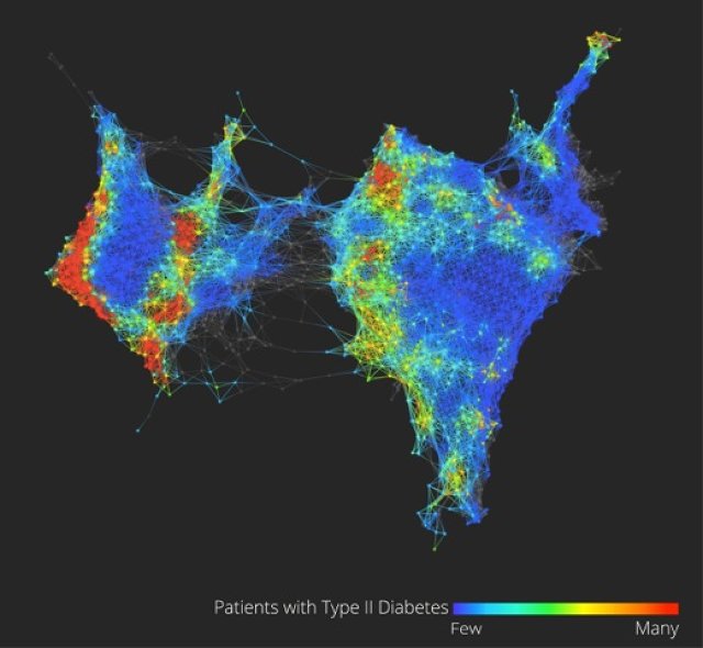
In disease surveillance we often look back — the way we do claims data now – years later or months later you get the reports and you look for the outbreak, and often times the outbreak’s already come and gone by the time you pick it up. But I started thinking and imagining: What if the second something happens, you can start monitoring it? In New York City the fire department was monitoring ambulance calls. I said, ‘Wow, if we could just categorize those by the type of call, maybe we’ll see some sort of signal in the noise there.’

When I was first able to visualize the trends in the proportion of ambulance dispatches in NYC that were due to respiratory distress, what I saw was flu.  What jumped out at me was the sinusoidal curve. Wham! At different times of year, it could be a stutter process – it would go up and you would see this huge increase, followed two weeks later by an increase in deaths. It was like the sky opening up. The evidence was there all along, but I am the first human being on earth to see this. That was validation, for me, of the idea that electronic data opens up worlds. To bring that data to life, to be able to extract meaning from those zeros and ones — that’s life and death. That was my first ‘aha’ moment.

The second aha was after I joined New York City Department of Health, and I started a data shop to build our policy around smoking and tracking chronic diseases. What we realized was that healthcare was leaving lives on the table. There were a lot of lives we could save by doing basic stuff a third-year medical student should do, but we’re not doing it.  Related to that – Tom Frieden had a great TEDMED talk about everybody counts.

I said, ‘I want to take six months off and do a sabbatical, and see if there’s anything to using electronic health records to provide those insights, not to save lives by city level, but on the 10 to the 3 level – the 1,000 patient practice. That started the whole journey.  None of the vendors at the time had the vision we had, but we finally got someone to work with us and rolled this system out.  We called some doctors some 23 times, and did all the work to get to the starting line.  Finally, I took Tom on a field visit to see one of the first docs to get the program.

It was a very normal storefront in Harlem, and a nice physician, very caring, very typical.  I asked her what she thought of the program. She said, ‘It’s ok. I’m still getting used to it.’  I said, ‘Did you ever look at the registry tab on the right, where you can make a list of your patients? She said no.  I said, ok – how many of your elderly patients did you vaccinate for flu this year? She said, ‘I don’t know, about 80 to 85 percent.  I’m pretty good at that.’  I said, ‘o.k., let’s run a query.’  And it was actually something like 22 percent. And she said – this was the aha moment – ‘That’s not right.’

That’s generally the feeling the docs have when they get a quality measure report from the health plan. But that’s population health management — the ability to see for the first time ever that everybody counts. And being able to then think about decision support and care protocols to reduce your defect rate. That was the validation that we’re on to something. Without the tools to do this, all the payment changes in the world can’t make healthcare accountable for cost and quality if you can’t see it.

WZ: Everyone has that moment in life when they’re considering all of their career options. As you were considering medical school, what else was on the table?

I actually didn’t think I was going to go to medical school. I was at the Harvard School of Public Health. I was interested in making an impact in public health. I grew up in Iran, and thought I would do international public health work. And then my dad got sick; he had a cardiac issue. The contrast between the immediacy of the laying on of hands of healthcare, and the somewhat abstractness of international public health — the distance, the remove — tipped me into saying,  ‘You know, maybe I should go to medical school.’  I’ve been on that edge between healthcare and public health ever since, and always trying to drag the two closer to each other.

SL: Fast forward 20 years.  You’re giving another talk at TEDMED.  What’s the topic?

TEDMED and Jay Walker’s vision is more powerful in the futurescope, rather than in the retroscope. It’s more powerful to be where we are today and imagine a different future rather than look back and say, ‘Oh, yeah, we’ve done this.’  So what’s the future I would love to imagine?

The most exciting thing – as Jay Walker once mentioned in a talk comparing “medspeed” to “techspeed” – is to fully imagine what will happen if techspeed is brought to healthcare. Right now, there’s all this unrealized value that’s being given away for free that doesn’t show up on any GDP lists – what Tim O’Reilly called “the clothesline paradox.”  That kind of possibility brought to medicine, but where software costs $100,000 as opposed to free, and it evolves daily and is more powerful and quicker every day, and it’s beautiful and usable and intuitive, and that’s what people compete on.

And all of that is toward the goal of empowering people.  Someone said, maybe it was Jay at TEDMED, that a 14-year-old kid in Africa with a smart phone has more access to information than Bill Clinton did as President. Information is power, and it has changed everything but healthcare. For me the vision is breaking down that wall, so that patients can be empowered and can bind themselves to the mast to use what we’ve learned about how behavior changes.

It’s not as simple as you give people information and they change their behavior.  It’s information tools that build on that data and build on communities and a much more sophisticated understanding about how behavior changes. What TEDMED is also great at, is understanding the power of marketing. People think of marketing of being about advertising, but marketing is the best knowledge we have about how to change behavior and all those intangibles, those predictably irrational insights, of how and why we do what we do.

It’s harnessing those, instead of having them lead to worse health – like present value discounting that leads to people wanting to procrastinate and eat that doughnut now instead of going to the gym. Or the power of anchoring, where we fixate on the first thing we see and won’t think objectively about the true risks of things. Or the herd effect, our friend is overweight and so we are more likely to be overweight.

All those nudges that are possible can be delivered to us ubiquitously and continuously, and we can choose to have them. It’s not some big brother dystopic vision. It’s me saying, ‘I want to be healthier, so I will do something now that will help me overcome and use my irrationality to help me stay healthy.  To me, that’s the neat new edge between mobile cloud computing, personal healthcare, behavioral economics, healthcare IT, data science and visualization, design, and marketing. It’s that sphere that has so many possibilities to get us to better health.

The thing about the health is, we have a Persian saying: Health is a crown on the head of the healthy that only the sick can see. When you have it, you don’t appreciate it, but when you’re sick and someone you love is sick, there’s nothing better.  You would do anything to get that. We need to bring that vision of the crown to everyone and help each of us grab it when we can.

WZ: I noticed you closing your eyes while preparing to answer a question. How do you pursue being able to exercise your imagination, in particular while you’re sitting in a building that’s been marked for being the least imaginative?

Because the world, as it is, is too immediate and real and limiting, sometimes you have to close your eyes to see a different world.

What has been amazing has been to see that, contrary to what people expect, this building is filled with people with untapped, unbound, unfettered imaginations who are slogging through. They’re just trapped. You give them the opening, the smallest bit of daylight to exercise that, and they’re off and running.

I give a lot of credit to Todd Park as our “innovation fellow zero,” He saw the possibility that there are more than two kinds of people in the world, innovators and everybody else. For him, it was about going to create a space where outside innovators can be the catalyst or spark that elevates and permissions the innovation of the career civil servant at CMS in Baltimore. That’s been cool.

SL: What’s your bowtie going to do after you leave HHS?  Will we see it lounging on the beach in Boca?

I like the bowtie.  I think I’m going to keep it.  Perhaps the @FarzadsBowtie Twitter handle is going to go into hibernation, I don’t know.  I don’t control it. One of the things the bowtie does for me is help me remember not to get too comfortable.

I once said at the Consumer Health IT Summit – ‘You’re a bunch of misfits – glorious misfits. And I feel like I’m very well suited to be your leader. You know, I always felt American in Iran, and felt Iranian in America when I came here. I felt like a jock among my geeky friends, and like a geek among jocks. For crying out loud, I wear a bowtie!  I don’t have to tell you I’m a misfit.’

It’s that sense of not fitting into the world as it is. The world doesn’t fit me.  So instead of saying,  ‘I need to change,’ this group of people said, ‘The world needs to change.’ That’s the difference between a misfit and a glorious misfit.

The person who doesn’t fit into our healthcare system is the patient. The patient’s preferences don’t fit into the need to maximize revenue and do more procedures. The patient’s family doesn’t fit into the, ‘I want to do an eight-minute visit and get you out the door’ agenda. The patient asking questions doesn’t fit.  That’s the change we need to make. It’s not that we need to change. Healthcare needs to change to fit the patient.

Shortly following this interview, Dr. Mostashari left HHS and is now the a visiting fellow of the Engelberg Center for Health Care Reform at the Brookings Institution, where he aims to help clinicians improve care and patient health through health IT, focusing on small practices.

This interview was edited for length and readability.

Step Jockey – real world calorie indicators

  • terrific behavioural intervention
  • funded by UK Dept of Health

http://www.springwise.com/london-begins-labeling-physical-world-calorie-loss-indicators/

London begins labeling the physical world with calorie loss indicators

StepJockey is a project that raises awareness of the benefits of taking the stairs through smart labels that detail how many calories can be lost by climbing them.

alttext

United Kingdom 27th November 2013 in GovernmentHealth & WellbeingLife Hacks.
Some people are fitness freaks and some are couch potatoes, but it actually doesn’t require rigorous exercise to stay in good shape. We previously wrote about Coca-Cola’s Work It Out Calculator — which details the small tasks that cancel out the calories in its products — and now the UK’s StepJockey is a project that raises awareness of the health benefits of actions such as taking the stairs, through smart labels that detail how many calories can be lost by climbing them.

Funded by the UK Department of Health, the startup believes that walking up and down stairs, rather than taking an elevator or escalator, can improve cardiovascular fitness and even help people lose weight. StepJockey’s research suggests that stair climbing burns more calories per minute than jogging and even walking down them is more healthy.

The team is currently crowdsourcing data about the country’s stairs, encouraging fans to type in the location of the office building or public staircase they want to measure and count how many steps there are. The site — or free iPhone app for smartphone users — then calculates how many calories are burned by using them. Users can then print off or order posters to hang next to the stairs, giving passersby that extra bit of encouragement to avoid the easy way up. Each poster features a QR code and NFC tag, enabling those with smartphones to log, track and share their calorie burning with friends.

According to StepJockey, the signs were developed using the principles of behavioral science, and tests proved that the nudge to take the stairs improved usage by up to 29 percent in some cases. Are there other aspects of the real world that can be improved with the addition of similar labels, offering useful data and digital interaction?

Website: www.stepjockey.com
Contact: www.stepjockey.com/contact-us

Spotted by Murray Orange, written by Springwise