Category Archives: research methodology

the world’s most potent, booming unnatural resource: data


Predictive analytics is “powered by the world’s most potent, booming unnatural resource: data.”

You have been predicted — by companies, governments, law enforcement, hospitals, and universities. Their computers say, “I knew you were going to do that!”

Great quotes from Eric Siegel.

http://bigthink.com/big-think-edge/you-can-predict-the-future

You CAN Predict the Future, and Influence It Too

FEBRUARY 13, 2014, 12:00 AM
Shutterstock_64061473

We are better than ever at making predictions – whether you’re going to click, lie, buy or die, as Eric Siegel puts it.

In a lesson on Big Think Edge, the only forum on YouTube designed to help you get the skills you need to be successful in a rapidly changing world, Siegel, a former professor at Columbia University, shows how predictive analytics is “powered by the world’s most potent, booming unnatural resource: data.”

You have been predicted — by companies, governments, law enforcement, hospitals, and universities. Their computers say, “I knew you were going to do that!”

Advertising

Netflix and Pandora predict the movies and music you will like. Online dating sites select possible matches for you based on your interests. Companies can predict whether you’re going to default on your credit card statements and whether you’re going to commit an act of fraud.

So what do governments and companies do with this gold mine? In the video below, Siegel tells Big Think that these entities not only have the power to predict the future “but also to influence the future.”  And so can you.

Sign up for a free trial subscription on Big Think Edge and watch Siegel’s lesson here:

https://www.youtube.com/watch?v=Kriiamz9KqQ

Reflection Questions 
— Describe how your company is using predictive analytics to influence any operational decisions? Do you analyze who is likely to respond before initiating a marketing campaign? If not, how could this help streamline operations in your department?– How are predictive analytics at work in your life? Do you use Netflix or Pandora to predict movies or music you will like? Have you used an online dating site that selects possible matches for you based on your interests? How has this worked out for you?

— Is the use of predictive analysis exposing people to other people, entertainment, or services that more accurately match their interests or is it pigeonholing people by suggesting things they may like based only on a limited amount of information on previous decisions they’ve made?

For expert video content to inspire, engage and motivate your employees, visit Big Think Edge

Watch the video below and sign up for your free trial to Big Think Edge today. 

A clear head shot on big sugar, soda etc…

Jenny Brand Miller commences her long-overdue capitulation…

http://www.smh.com.au/national/health/australian-paradox-author-admits-sugar-data-might-be-flawed-20140209-329h1.html

http://www.abc.net.au/radionational/programs/backgroundbriefing/2014-02-09/5239418#transcript

Is sugar innocent?

Sunday 9 February 2014 8:05AM

Controversial research by two leading nutritionists which claims sugar has had no role to play in Australia’s obesity crisis is now under investigation by Sydney University.   The paper claims that sales of soft drinks have declined by 10 per cent, but now it looks like the nutritionists themselves are walking away from that statistic, as Wendy Carlisle writes.

What role does sugar play in Australia’s obesity crisis?

According to research from two leading nutritionists, the answer is not much at all.

If that’s the case, it means Australia is unique and sugar is not implicated in our ever expanding girths.  If the research is true, then sugar and in particular soft drinks are off the hook.

The research comes from one of Australia’s best known nutritionists, Professor Jennie Brand Miller, and her colleague Dr Alan Barclay.

Professor Brand Miller devised the Low GI diet and has sold millions of Low GI cookbooks. ‘GI Jennie’, as she is also known, is associated with Sydney University’s  $500 million Charles Perkins Centre for Obesity Research.

Australia’s obesity problem is unique, says Professor Brand Miller: ‘Australia is actually bucking the trend with respect to added sugars; there is good evidence that we are not increasing our intake, with various lines of evidence suggesting our consumption has been in the process of a long decline for quite a long period of time.’

This article represents part of a larger Background Briefing investigation. Listen to Wendy Carlisle’s full report on Sunday at 8.05 am or use the podcast links above after broadcast

The pair examined  FAO datasets on  Australian sugar and  concluded there has been a ‘substantial and consistent decline’ in the consumption of sugar by Australians since 1980.

After examining industry data on soft drink sales, they found Australians have cut their consumption of soft drinks by 10 per cent since 1994.

Not surprisingly, the soft drink industry is thrilled and the findings have been cited widely by the industry in their case against government regulation. We might be getting heavier as a nation, but we can’t blame sugar, says the industry.

‘Soft drinks in particular seem to be in the firing line as some sort of unique contributor to obesity,’ says Geoff Parker CEO of the Australian Beverage Council.

‘The findings do confirm  the Australian Paradox in that there has been a substantial decline in refined sugars over the timeframe that obesity has increased, so the implication is that efforts to reduce sugar intake  may not reduce the prevalence of obesity.’

Are we drinking more or less?

Image: Source: Australian Beverages Council


The Australian paradox would seem to let the soft drink industry and sugar off the hook, except that research is now under intense scrutiny from both Sydney University and the dogged form of former Reserve Bank economist Rory Robertson, who calls the research a ‘menace to public health’.

Mr Robertson has been complaining long and loud to the journal Nutrition and to Sydney University and for two years he says they told him to ‘get lost’.

Late last year the university announced a initial inquiry into the research under its research code of conduct.  An external investigator has been appointed.  If the investigator finds there is case to answer, the inquiry will proceed.

Until then, the university will not comment.

One of the most glaring errors in the paper, Mr Robertson says, is the claim that we are drinking 10 per cent less soft drink since 1994.

‘They show a chart of sugary soft drinks sales in Australia between 1994 and 2006, and that chart shows a rise in sugary soft drink sales from 35 L per person per year in 1994 to 45 L per person per year in 2006,’ he says.

‘And in the paper they describe  as a 10 per cent decline, which is nonsense—obviously it’s a 30 per cent increase.’

Are we drinking more or less? Image: The Australian Paradox: ‘Food industry data indicate per capita sales of low calorie (non-nutritively sweetened) beverages doubled from 1994 to 2006 while nutritively sweetened beverages decreased by 10 per cent.’ (Source: Australian Beverages Council)


It seemed to be an easy point to fact check.  Graph 5A in the Australian Paradox does indeed trend up by around 30 per cent between 1994 and 2006.

How could the Australian Paradox maintain this was an decrease when the graph clearly showed sales had gone up?

The responses from Professor Jennie Brand Miller and Dr Alan Barclay to Background Briefings inquiries have been equivocal.

Last Wednesday Dr Alan Barclay emailed to say: ‘Your claim is most certainly wrong’.  After another series of email exchanges another answer came through on Thursday.

‘The 10 per cent decline could not possibly refer to per capita sales of nutritively sweetened soft drinks,’ wrote Dr Barclay.

‘I’m sorry I cannot make it more clear than this.’

The paper remains on the Sydney University website of the Glycemic Index Foundation.


Transcript

Hide

A transcript of this program will be made available by the Tuesday following the broadcast.

Credits

Reporter
Wendy Carlisle
Researcher
Anna Whitfeld
Supervising Producer
Linda McGinness
Sound Engineer
Executive Producer
Chris Bullock

sugar = heart disease

  • n=43,000 adults published in JAMA Int Med
  • a significant relationship between added sugar consumption and increased risk for CVD [cardiovascular disease] mortality”
  • 10%-25% of calories from added sugars had a 30% higher risk of heart disease vs less than 10% group
  • consuming more than 25% of calories from sugar (10% of the sample) were nearly 3 times as likely to die as a result of heart disease
  • In this latest study, sugar-sweetened beverages provided the largest amount of added sugar in participants’ diets, at 37.1%, followed by grain-based desserts at 13.7%, juice drinks (8.9%), dairy desserts (6.1%) and confectionery (5.8%).
  • “the present study, perhaps more strongly than previous ones, suggests that those whose diet is high in added sugars may also have an increased risk of heart attack.”
  • “The first target, now taken up by an increasing number of countries, is to tax sugar rich drinks. Whilst this may seem a blunt instrument, the food and drink industry are able to make positive changes in their food formulations and still remain very profitable. Ultimately, there needs to be a refocus to develop foods which not only limit saturated fat intake but simultaneously limit refined sugar content.”


http://www.foodnavigator-usa.com/R-D/Sugar-consumption-linked-to-heart-disease-death-risk/

Sugar consumption linked to heart disease death risk

The risk of dying from heart disease increased exponentially with the amount of added sugars consumed

The risk of dying from heart disease increased exponentially with the amount of added sugars consumed

Excessive consumption of added sugars in drinks, snacks and sweets is associated with an increased risk of dying from heart disease, according to a major US review published in JAMA Internal Medicine.

The review, which looked at the sugar consumption habits of nearly 43,000 adult participants in a national health survey, found a significant relationship between added sugar consumption and increased risk for CVD [cardiovascular disease] mortality”.

Dr Quanhe Yang of the Centers for Disease Control and Prevention in Atlanta and colleagues found that regularly consuming as little as one sugary fizzy drink a day was associated with an increased risk of death from heart disease. The results suggested that CVD mortality risk increased exponentially the greater the amount of sugar consumed on a regular basis.

“Our results support current recommendations to limit the intake of calories from added sugars,” they wrote.

This is not the first time that high sugar consumption has been linked to heart disease risk, but the researchers said that few studies had examined sugar consumption in connection with heart disease mortality.

WHO recommendations

The World Health Organisation recommends that fewer than 10% of a person’s daily calories should come from added sugars, but most people in Europe and the United States exceed that amount.

In this study, those who consumed 10% to 25% of calories from added sugars had a 30% higher risk of dying from heart disease compared to those whose sugar calorie consumption was less than 10% of total calories. Those for whom added sugars accounted for more than a quarter of calories – about 10% of the study sample – were nearly three times as likely to die as a result of heart disease.

A total of 71.4% of participants consumed more than 10% of their calories from added sugars.

Association…not causation

Commenting on the study, professor of metabolic medicine at the BHF Glasgow Cardiovascular Research Centre, Professor Naveed Sattar, said that observational studies can never prove that sugar consumption causes heart attacks.

“However, to ignore the mounting evidence for the adverse health effects of excess sugar intake would seem unwise,” he said. “Helping individuals cut not only their excessive fat intake, but also refined sugar intake, could have major health benefits including lessening obesity and heart attacks.”

“…We have known for years about the dangers of excess saturated fat intake, an observation which led the food industry to replace unhealthy fats with presumed ‘healthier’ sugars in many food products. However, the present study, perhaps more strongly than previous ones, suggests that those whose diet is high in added sugars may also have an increased risk of heart attack.”

In this latest study, sugar-sweetened beverages provided the largest amount of added sugar in participants’ diets, at 37.1%, followed by grain-based desserts at 13.7%, juice drinks (8.9%), dairy desserts (6.1%) and confectionery (5.8%).

Sattar added: “The first target, now taken up by an increasing number of countries, is to tax sugar rich drinks. Whilst this may seem a blunt instrument, the food and drink industry are able to make positive changes in their food formulations and still remain very profitable. Ultimately, there needs to be a refocus to develop foods which not only limit saturated fat intake but simultaneously limit refined sugar content.”


Source: JAMA Internal Medicine

Published online ahead of print. doi:10.1001/jamainternmed.2013.13563

“Added Sugar Intake and Cardiovascular Diseases Mortality among US Adults”

Authors: Quanhe Yang; Zefeng Zhang; Edward W. Gregg; W. Dana Flanders; Robert Merritt; Frank B. Hu.

Disinformation Visualization

Good, clean, wholesome analytics home truths…

Disinformation Visualization: How to lie with datavis

By Mushon Zer-Aviv, January 31, 2014

Seeing is believing.

When working with raw data we’re often encouraged to present it differently, to give it a form, to map it or visualize it. But all maps lie. In fact, maps have to lie, otherwise they wouldn’t be useful. Some are transparent and obvious lies, such as a tree icon on a map often represents more than one tree. Others are white lies – rounding numbers and prioritising details to create a more legible representation. And then there’s the third type of lie, those lies that convey a bias, be it deliberately or subconsciously. A bias that misrepresents the data and skews it towards a certain reading.

It all sounds very sinister, and indeed sometimes it is. It’s hard to see through a lie unless you stare it right in the face, and what better way to do that than to get our minds dirty and look at some examples of creative and mischievous visual manipulation.

Over the past year I’ve had a few opportunities to run Disinformation Visualization workshops, encouraging activists, designers, statisticians, analysts, researchers, technologists and artists to visualize lies. During these sessions I have used the DIKW pyramid (Data > Information > Knowledge > Wisdom), a framework for thinking about how data gains context and meaning and becomes information. This information needs to be consumed and understood to become knowledge. And finally when knowledge influences our insights and our decision making about the future it becomes wisdom. Data visualization is one of the ways to push data up the pyramid towards wisdom in order to affect our actions and decisions. It would be wise then to look at visualizations suspiciously.

Centuries before big data, computer graphics and social media collided and gave us the datavis explosion, visualization was mostly a scientific tool for inquiry and documentation. This history gave the artform its authority as an integral part of the scientific process. Being a product of human brains and hands, a certain degree of bias was always there, no matter how scientific the process was. The effect of these early off-white lies are still felt today, as even our most celebrated interactive maps still echo the biases of the Mercator map projection, grounding Europe and North America on the top of the world, over emphasizing their size and perceived importance over the Global South. Our contemporary practices of programmatically data driven visualization hide both the human brains and eyes that produce them behind data sets, algorithms and computer graphics, but the same biases are still there, only they’re  harder to decipher.

Wearables meets big data

Some see this as an opportunity to mobilise a peer-to-peer health knowledge commons outside the healthcare system that is filtered through government, hospitals and GPs’ surgeries. This new healthcare system would exist out among the public.

Pioneered by Tedmed’s clinical editor, Wellthcare tries to pinpoint the new kind of value that this people-powered healthcare system would create.

“Wellth” is closer to the idea of wellbeing or wellness than health; it is about supporting “what people want to do, supported by their nano-networks”.

A healthcare system that uses data we collect about ourselves would require these new bodies to make much bigger choices about how NHS trusts procure products and services.

Going back to the ever expanding market for wearable technology – with a potential patient group of 80m, there should be a lot more going on to turn our physiological data in the treasure trove it could be. Forget supermarket reward points and website hits, the really big data only just arrived.


http://www.theguardian.com/science/political-science/2014/jan/27/science-policy

Big data gets physical

Posted by 
Tuesday 28 January 2014 01.05 EST
Can we make the rise of wearable technology a story about better health for everyone, not just better gadgets for me?
Smartphone app visualises two similar running routes
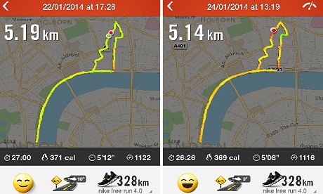
Smartphone app visualises two similar running routesI am obsessed with my running app. Last week obsession became frustration verging on throw-the-phone-on-the-floor anger. Wednesday’s lunchtime 5km run was pretty good, almost back up to pre-Christmas pace. On Friday, I thought I had smashed it. The first 2km were very close to my perennial 5 min/km barrier. And I was pretty sure I had kept up the pace. But the app disagreed.As I ate my 347 calorie salad – simultaneously musing on how French dressing could make up 144 of them – I switched furiously between the two running route analyses. This was just preposterous; the GPS signal must have been confused; I must have been held up overtaking that tourist group for longer than I realised; or perhaps the app is just useless and all previous improvements in pace were bogus.My desire to count stuff is easy to poke fun at. It’s probably pretty unhealthy too. But it’s only going to be encouraged over the next few years. Wearable technology is here to stay. Smart phone cameras are also heart rate monitors. Contact lenses can measures blood sugar. And teddy bears take your temperature. A 2011 market assessment, estimated that there will be 80m sports, fitness and “wellness” wearable devices by 2016.

At the moment, it’s difficult to retrieve the data these systems collect. Nike only allow software developers access to data produced by people like me so they can create new features for their apps. I cannot go back and interrogate my own data.

Harbouring user data for product development is an extension of part of the search engine or mobile provider business model. When you log in to Gmail while browsing the internet, you give Google data about your individual search behaviour in exchange for more personalised results. Less obviously, when you use the browser on your phone, mobile companies collect (and sell) valuable data about what you are looking for and where you are. The latest iteration of this model is Weve, providing access to data about EE, O2 and Vodafone customers in the UK.

After Friday lunchtime’s outburst, I accepted that I’d never find the cause of my wayward run and quickly got absorbed back into the working day.

But I shouldn’t have.

We talk about the economic and social value of opening up government data about crime numbers or hospital waiting times. But what about the data we’re collecting about our daily lives? This is not just a resource for running geeks to obsess over, it provides otherwise unrecorded details of our daily lives. Sharing data about health has the potential to be an act of generosity and contribution to the public good.

For some areas of healthcare, particularly for type 2 diabetics or those with complex cardiovascular conditions, lifestyle information could make a huge difference to how we understand and treat patients. It could provide the kind of evidence badly needed to make headway in areas where clinical trials aren’t enough.

But it’s not yet easy to make something of this broader value created by fitness apps or soft toys with sensors in them. One person’s data is saved in different ways through different services – making for a messy, distributed dataset.

There is also no clear way to incorporate this into the current healthcare system. Some companies have made strides in that direction. Proteus Digital Health offers a system for monitoring a patient’s medication and physical activity using an iPad app and ingestible pills. This takes some much needed steps towards understanding how people comply with their prescription. At the moment, only 50% of patients suffering from chronic diseases follow their recommended treatment. If Proteus starts to sell information back to the health service, it will take digital health into mainstream healthcare. However,it hasn’t reached that point yet. And it is still a rare example of a company with the regulatory approval to do so. For example, Neurosky’s portable EEG machines, which measure brain activity, make excellent toys. But the company has no intention of certifying its products as medical equipment, given the time and expense it requires.

But does that matter? Neurosky’s wizard-training game Focus Pocus improves a player’s cognitive abilities including memory recall, impulse control, and the ability to concentrate. Some US medical practitioners are now prescribing Focus Pocus. This makes biofeedback therapy to ADHD patients available at home, replacing two to three hospital visits a week. This is going on anyway – outside the mainstream healthcare system.

Some see this as an opportunity to mobilise a peer-to-peer health knowledge commons outside the healthcare system that is filtered through government, hospitals and GPs’ surgeries. This new healthcare system would exist out among the public. Pioneered by Tedmed’s clinical editor, Wellthcare tries to pinpoint the new kind of value that this people-powered healthcare system would create. “Wellth” is closer to the idea of wellbeing or wellness than health; it is about supporting “what people want to do, supported by their nano-networks”. There is the potential for a future where we move from producers of data that is sucked up by companies into producers of data who consciously share it with one another, learn to interpret it and make judgments from it ourselves.

The current healthcare system may evolve to support this kind of change. In the UK, Academic Health Science Networks and Clinical Commissioning Groups provide new structures within the NHS that have the potential to support disruptive innovations. But so far these have led to small, incremental changes. A healthcare system that uses data we collect about ourselves would require these new bodies to make much bigger choices about how NHS trusts procure products and services.

Going back to the ever expanding market for wearable technology – with a potential patient group of 80m, there should be a lot more going on to turn our physiological data in the treasure trove it could be. Forget supermarket reward points and website hits, the really big data only just arrived.

Ornish at TED

http://deanornish.com/

  • Wellness vs Illness – We vs I
  • 95% of NCD is preventable
  • NCDs are also reversible
  • Prostate Cancer, Breast Cancer susceptible to diet change
  • Obesity Trends in the US – new categories on the US map
  • Has worked with McDonalds and Pepsi to advise on products – didn’t go anywhere

Ornish Healthways Spectrum Program
http://deanornish.com/ornish-spectrum/

16 min: Healing Through Diet
http://www.ted.com/talks/dean_ornish_on_healing.html

3 min: Your Genes Are Not Your Fate

3 min: Killer Diet

Institute for Health Metrics and Evaluation (IHME)

Gates Foundation backed Washington University team doing some amazing work on gathering, analysing and presenting global burden of disease metrics for easy browsing.

http://www.healthmetricsandevaluation.org/gbd/visualizations/gbd-arrow-diagram

Data Visualizations

IHME strives to make its data freely and easily accessible and to provide innovative ways to visualize complex topics. Our data visualizations allow you to see patterns and follow trends that are not readily apparent in the numbers themselves. Here you can watch how trends in mortality change over time, choose countries to compare progress in a variety of health areas, or see how countries compare against each other on a global map.

Not sure which visualization will provide you with the results you are looking for? Click here for a guide that will help you determine which tool will best address your data needs.

GBD Compare is new to IHME’s lineup of visualizations and has countless options for exploring health data. To help you navigate this new tool, we have a video tutorial that will orient you to its controls and show you how to interact with the data. You can also watch the video of IHME Director Christopher Murray presenting the tools for the first time at the public launch on March 5, 2013.

Tobacco Burden Visualization

This interactive data visualization tool shows modeled trends in tobacco use and estimated cigarette consumption worldwide and by country for the years 1980 to 2012. Data were derived from nationally representative sources that measured tobacco use and reports on manufactured and nonmanufactured tobacco.

US Health Map

With this interactive map, you can explore health trends in the United States at the county level for both sexes in: life expectancy between 1985 and 2010, hypertension in 2001 and 2009, obesity from 2001 to 2011, and physical activity from 2001 to 2011.

GBD Compare

Analyze the world’s health levels and trends in one interactive tool. Use treemaps, maps, and other charts to compare causes within a country, compare countries with regions or the world, and explore patterns and trends by country, age, and gender. Drill from a global view into specific details. Watch how disease patterns have changed over time. See which causes of death and disability are having more impact and which are waning.

Mortality Visualization

How does input data become a GBD estimate? Walk through the estimation process for mortality trends for children and adults for 187 countries. See the source data and then watch as various stages in the estimation process reveal the final mortality estimates from 1970 to 1990.

COD Visualization

Where do we have the best data on the different health conditions? For any age group, see where the various data sources have placed the trends in causes of death over time. You can examine more than 200 causes in both adjusted and pre-adjusted numbers, rates, and percentages for 187 countries.

GBD Insight

What are the health challenges and successes in countries around the world?

GBD Heatmap

How do different health challenges rank across regions?

GBD Arrow Diagram

How has the burden of different diseases, injuries, and risk factors moved up or down over time?

GBD Uncertainty Visualization

Where do we have the best data on the different health conditions?

GBD Cause Patterns

What diseases and injuries cause the most death and disability globally?


The Quantified Diet Project

  • These guys are using some new approach to test the efficacy of popular diets – something that’s casual, natural, low-key, low-touch but statistically powered up – again, aligned with Riot’s ambitions
  • I’ve signed up and been allocated the mindfulness eating diet
  • Will see how we go… what could possibly go wrong?

https://lift.do/quantified-diet

The Quantified Diet Project

Make a healthier you. Contribute to a healthier world.

The Quantified Diet Project aims for two things:

#1. Help one million people make a healthy diet change leading to: weight loss, overall health, and/or more energy. We’re providing 10 popular diets with expert advice.

#2. Perform the largest-ever measurement of popular diets. What works? How do popular diets compare? How can we all be more successful? We’re working with UC Berkeley on the science and the analysis.


The official launch is January 1st, but you can start contributing to our science right now by filling out this survey.


How it works

You’ll follow one of the following diets for four weeks:

  1. Slow-Carb Diet®: Meat, legumes/beans, and veggies; abstain from white foods like sugar, pasta, bread, cheese; epic “cheat day” once per week. Advised by Tim Ferriss, author of The 4-Hour Body.
  2. Paleo: eat like a caveman, mostly veggies, meats, nuts. Advised byPaleohacks and Nerd Fitness.
  3. Vegetarian: vegetables, but no meat. Cheese and eggs are optional. Advised by No Meat Athlete.
  4. Whole foods: eat only recognizable foods and avoid processed ones. Advised by Summer Tomato.
  5. Gluten-free: no wheat, rye, barley or wheat-based foods. Advised by Tania Mercer.
  6. No sweets: a simple diet change that affects your insulin swings. Advised by Sarah Stanley.
  7. DASH: USDA’s current recomendation.
  8. Calorie counting: the old standard.
  9. Sleep more: the science says this should work. Advised by: Swan Sleep Solutions.
  10. Mindful eating: learn mindfulness to recognize when you’re full. Advised by ZenHabits.

During the diet, you’ll use the Lift app to receive daily prompts and to track your progress.

When you need help, you’ll have access to our hand-picked experts and to tips from the rest of the community.

Science aside, the first goal is for you to make a healthy diet change. This is our specialty.

Also, there will be prizes available at important milestones.


The Science

In order to do this in a scientific way we’re working with nutritionists and statisticians from UC Berkeley.

During the sign-up process, you’ll have the option to be given a diet that we’ve selected for you. The scientific process calls this part of the experiment randomization. The intent is to remove bias—perhaps fans of the4-Hour Body diet are inherently more motivated than fans of the USDA.

I was skeptical about people accepting our diet recommendation for them, but early joiners have voted 3 to 4 to participate in the randomized trial. (There will also be an opt-out of the randomization step, for those 1 in 4 people who want complete control.)

After we get you going on your new diet, we’ll measure via Lift and occasional surveys:

  • Are some diets easier than others? The scientific term is adherence.
  • Weight change. Of course, this is a goal for many of us.
  • Happiness via mood, energy and enjoyment.
  • Demographic factors.
  • Success tips for each diet. In our single-diet trial of the 4-Hour Body last year, we were able to verify the effects of simple meal planning, eggs for breakfast, cold showers, cheat days, and alcohol consumption.

Of course, we’re going to be careful to respect your privacy. All data will be aggregated and anonymized. That’s really important to us.


You know what else is important? Your feedback. Email me or comment right here. I’m tony@lift.do.

HICCUP: Health Initiative Coordinating Council

This manifesto aligns tightly with my own vision of how preventive health funding should be financed – data-driven and in a for-profit context.

HICCup


The HICCup experiment: Manifesto

Just imagine:

It’s 2019 and the mayor is having a bad day.  She wants to spearhead a new community program for bike-sharing, but she’s not sure the town can afford it.  Meanwhile, one of the new council members is pushing for an overhaul of the school lunch program.  She sighs as the assistant deputy mayor walks in.  “What now, Henry?” she asks with a slight edge in her voice.  But Henry is cheerful: “Mayor, I think we may have a way to fix this. I was just reading about the HICCup Experiment in a town just like ours…. It seems that if we did both the bike program and the school lunches, and made some other changes..”

“But what about our rising health care costs?” asks the mayor.

“That’s the point,” says Henry.  “HICCup showed that we can actually reduce those costs if we do multiple interventions simultaneously…even though none of them by itself would make a difference. And there’s an investment banker who just called us that’s eager to work with us to finance the project.  They’re asking us to set up a meeting with the big employers and Mercy Saints Health. Using the HICCup data, they think they can finance it all out of the health-care cost savings that would result, as long as we commit to following certain protocols.”

And the vision:

Now it’s 2040.  The mayor’s teen-aged son, also called Henry, is discussing his history project on the HICCup Experiment with other members of his MOOC.  “Of course,” he concludes, “the HICCup Experiment proved that multiple interventions can dramatically include the overall health of a community.  But the Experiment itself wouldn’t work anymore, as a funding vehicle.”

“Why not?” asks Susan, who clearly hasn’t done her homework.

Henry responds patiently with the obvious answer: “Because there are very few places with inflated, unnecessary health care costs anymore.”

The background

It is hard to find anyone in health care who does not believe that spending an extra $100 now on healthy behavior – exercise and proper nutrition, counseling for pre-diabetics, risk monitoring, and so on – could yield more than $120 in lowered costs and improved outcomes later. The numbers are fuzzy, of course, and there are plenty of methodological caveats, but there is little dispute about the plausibility and desirability of such an approach.

Yet neither individuals nor communities seem to act on the basis of this knowledge. Moreover, it’s likely that spending $110 now has no impact, as other factors dissipate any gain, but spending $110 million now (vs. a health-care budget of $100 million) should indeed return savings of $20 million annually over time.  Individuals often lack willpower or access to healthy food or convenient exercise facilities, and are surrounded by poor examples that encourage instant gratification rather than effort and restraint. And, on a broader, institutional scale, the money spent and the money to be gained do not belong to the same pocket.

Enter HICCup!

The goal of HICCup, the Health Initiative* Coordinating Council, is to facilitate the launch of five to eight community-wide experiments dedicated to proving that this can work, and to learning from both successful and unsuccessful efforts.  HICCup is a self-appointed counseling service and will persuade and guide local institutions to embrace a long-term perspective and launch a full-scale intervention experiment in their communities. For practical reasons, there are a few guidelines – but anyone who wants to do this without following our rules is welcome to do so.   (*Yes, it used to be “health intervention…” but initiative is more friendly and positive, and still let us keep the logo!)

For starters, HICCup will focus on communities of 100,000 people or fewer. The majority of each community and its institutions must be enthusiastic for the initiative to gain traction. If the community members mostly work for just a few employers and obtain health care from just a few providers, that makes the effort of corralling the players easier. And, of course, you need community leaders – mayor, city council, and others – who will work together rather than undermine one another.

So, how will this be funded? Not by HICCup, which is only a coordinating body.  The trick is for an investor in each community to capture some of what is being spent already on health care. As a rough calculation, assume $10,000 in annual per capita health-care costs, or $1 billion per year in a community of 100,000. (There are also all the separate costs of bad health, which are much harder to count or capture.)  That money ultimately comes from individuals and employers who pay it in taxes, insurance premiums or direct payments; the place to intercept it is somewhere between the payers and the health-care delivery system.

Instead of spending $1 billion a year, imagine spending $1.1 billion the first two years, but, say, only $900 million in the fifth year (possibly a $300 million savings off projected costs of $1.2 billion by then). That sounds like an attractive proposition – but only if someone else will make that initial investment in return for a claim to those presumed later savings.  These numbers are just for illustration; figuring out actual and predicted numbers for each community will be a key task.

The first challenge is for each HICCup community to get the involvement of a benevolent but ultimately profit-driven billionaire or hedge fund, or a philanthropic fund that sees a way to do good while earning money for future goodness. There are a lot of billionaires out there, some with vision. There are health-care companies that might bite, hedge funds looking for large-scale projects, and so-called social-impact bonds. There also are large employers that might decide to work with other employers in certain communities.

The funder makes a deal with whoever is responsible for the health-care costs (buyers): The funder makes upfront investment in health interventions and pays the health-care costs, against continued payment from the health-care buyers of the $1-billion yearly baseline, with the funder to keep (most of) the savings against originally predicted rising costs in later years. The money may be paid by employers, private insurers (which collect it from individuals, who, in the United States, are now required to buy insurance) or from government health-care funds, which will be the trickiest source.

One way or another, the investor/experiment manager will need to figure out how to realign some of the sick-care facilities and workers to some other role, including prevention, serving outsiders or some other use entirely.  That’s the second challenge HICCup experimenters need to address – one that is being addressed in part by the creation of Accountable Care Organizations, but without community involvement in preventive health.

All together now!


All these entities will be taking a substantial leap of faith. But we believe they can succeed – especially if they work together through HICCup to figure out the numbers, study the effects of small-scale healthy-living/preventive health-care efforts, and encourage one another to move forward. Regardless, each investor must work with existing institutions – if only to get at the revenue stream initially and benefit from the lowered costs in later years.

Although grants are a nice source of funding for demonstration projects and research, the best way for HICCup’s vision to catch on and be widely copied is by adopting a for-profit approach that attracts broader investment once it is shown to work.  Indeed, if a benefactor makes a donation, they feel good when they send off the money. An investor feels good only after the investment actually pays off.

Community officials and voluntary organizations also need to sign on…or  they can drive the process and find the benefactor/investor. They will also contribute by implementing complementary changes in school meals and gym classes; enacting zoning and other changes to encourage cycling, walking, and the like; hiring health counselors and care workers; and perhaps working with local restaurants and food stores to subsidize healthy choices and discourage unhealthy ones.   Local media can report on the experiment’s progress, and each community will likely engage in healthy rivalry with other HICCup experimenters.

Though it won’t get to keep the direct health-care cost savings, each community will get all the ancillary benefits of a healthy population, including an enhanced reputation.  Indicators of population health include not just rates of obesity, diabetes, high blood pressure, and diseases and related costs, but also whether the elderly can live (and be cared for) at home, absenteeism, school grades and graduation rates, employment statistics, accidents, and the like. Although the funder keeps the reduction in health-care costs, the community gets the benefit in the many payoffs from a healthier population over time.

Open enrollment

HICCup will not choose which communities participate. They will be choosing them selves. HICCup’s role will be to advise them and help them to communicate and learn from other communities going through the same process. We also want to be a clearinghouse for vendors of health-oriented tools, services, and programs. There are many bargains to be struck between communities and vendors offering discounts in exchange for wholesale adoption of their tools or programs.

However, there is one unbreakable rule: To work with HICCup, communities must collect and publish a lot of independently vetted data (without personal information, of course). For starters, they will need benchmarks of current conditions and projected costs, and then detailed statistics on the adoption of the measures, their impact and costs, and what happens over time.  HICCup will welcome input from lawyers and actuaries!

It is now time to try this on a broad scale. Five years from now, we will wonder what took us so long to get started. So, again, who will those investors be?